My first tidytuesday
This week was the first time I participated in #tidytuesday - an online data project that provides every week a new dataset for participants to explore. The main goal of tidytuesday is to allow beginners and more advanced R users alike to
🔍 explore new data
🔨 practice their data science skills – not only in the tidyverse, although this is where tidytuesday got its name from in the first place
✨ come up with a cool and insightful visualization and
👏 make their code publicly available for others to learn from each other’s approach.
In the past, datasets covered a broad range of topics across different disciplines and interests such as Christmas Songs from the Billboard Top 100 dataset or CRAN Code. This week, the data came from TuitionTracker.org with plenty of information on college tuition fees in the US.
For my visualization, I was curious to see whether the net costs for studying vary across US states and, if so, whether we can identify some clusters of particularly expensive areas to study. Naturally, the expectation is that more expensive states to live in as well as, and in particular, those with Ivy League and Top 10 schools are also the most expensive to study in.
To identify the average costs of studying from the TuitionTracker.org dataset, I focused on the dataset tuition_income and in particular the variables net_cost (the average of what students in a given school actually paid after scholarship/award), state as well as year (ranging from 2010 to 2018). To get a good sense of whether specific regional patterns exist, I added information on the regions of each state (Northeast, South, North Central, South) from the build-in US state dataset in R.
Having to visualize the net costs for studying for 50 states (I excluded DC here to make it compatible with the state dataset) over 9 years is not an easy way to do in just one graph. On top of that, regional patterns almost always call for spatial visualizations with maps. For tidytuesday, I wanted to try a different approach.
Instead of maps, I use circular bar plots. Thanks to the fantastic document of circular bar plots on the
R-Graph-Gallery, the main work was to bring the data into the right format and to adjust the position of labels for each state and the respective net costs in a way that they follow the angle of the bars. In this way, I create 9 circular bar plots for each year and finally had a chance to use the
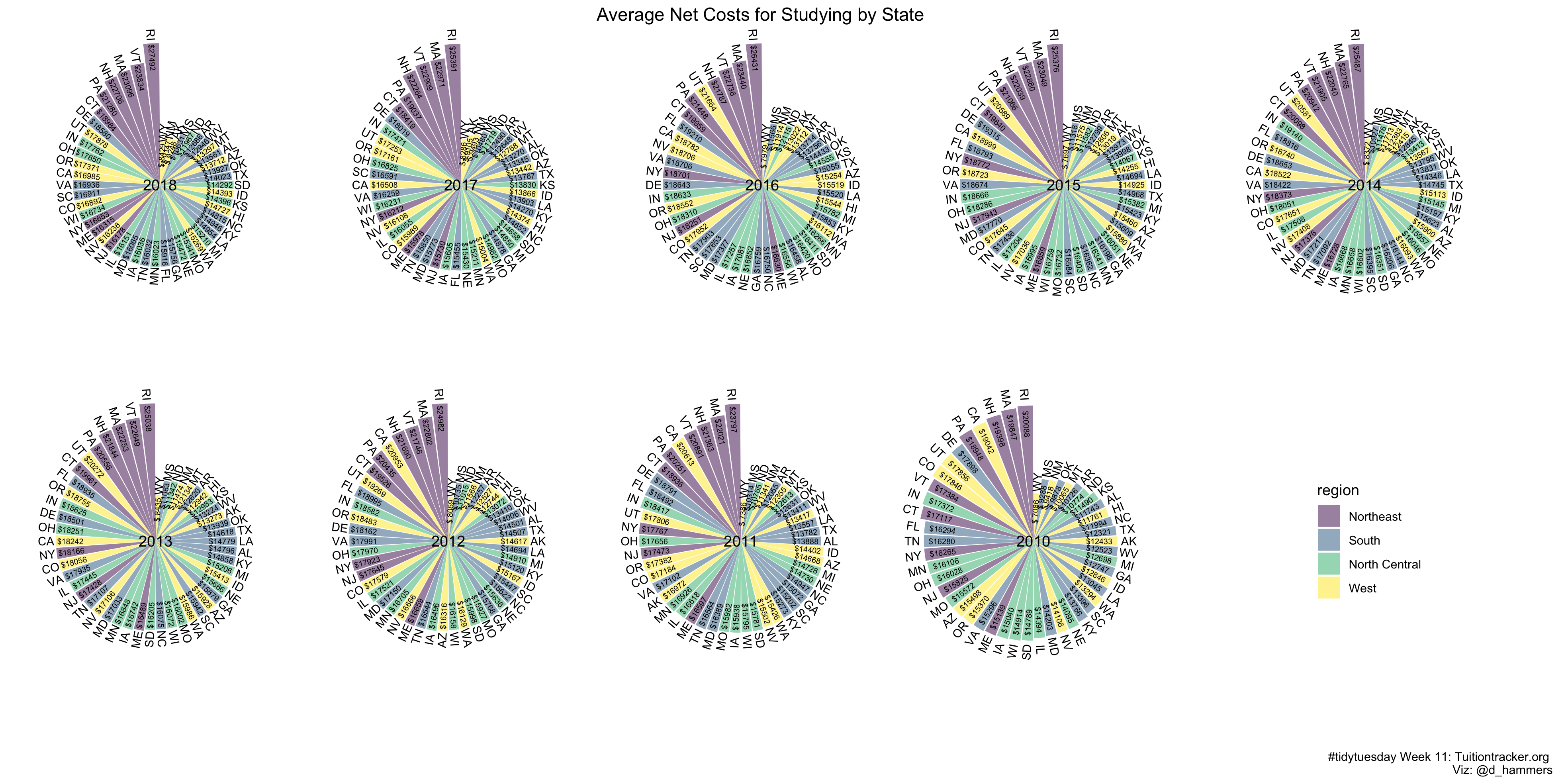
patchwork package for the first time! Patchwork allows to arrange graphs in any way possible using a syntax that could not be easier - essentially, you add graphs together using + or | and include another (row of) graph(s) using /. All together, the result is shown in the following visualization 👇

The outcome is not surprising: Northeastern states with relatively high costs of living and many high-ranked schools are also the most expensive ones to study in 💸. An interesting development is the relative ranking of California over the past years. From 2010 to 2012, California ranked among most expensive states along with most Northeastern states but since 2013, California became much more affordable in relative terms. Interesting enough, at the same time, Utah become more and more expensive, eventually making its way to one of the top 5 most expensive states to study in in 2016. However, as I am no expert on tuition fees and the particularities of the US college system, more domain knowledge is necessary to put these first impressions into perspective. But for a first glance at the data, the expectations about studying in the US seem to hold.
All code is available here 👉 GitHub account.