Data Visualization Blog
*
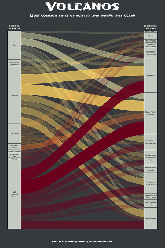
Volcano Eruptions
The graph shows different types of incidents that are associated with volcanos and where they have occurred the most since data is available to trace back the activity of volcanos.
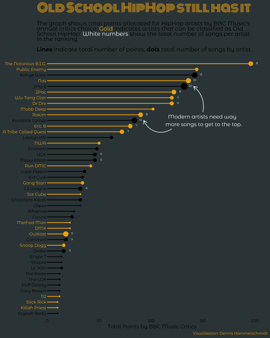
Best HipHop Artists of All Time
Who are the most important hiphop artists of all time? Based on BBC Music critics, the graph shows the ranking and number of songs per artist with a clear winner and some very interesting conclusions about the golden age of hiphop.
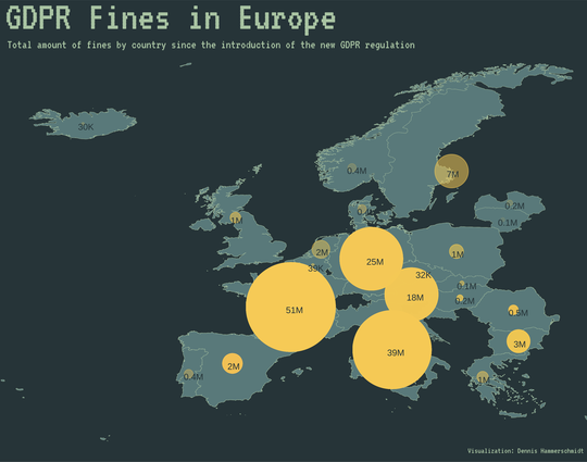
GDPR Violations
I use data on countries’ GDPR violations to show which government got fined the most.
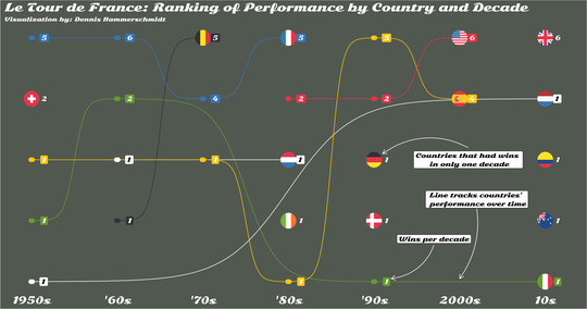
Tour de France Winners Over Decades
I use ggbump to illustrate a dynamic overview of countries’ wins at the Tour de France over the past decades.
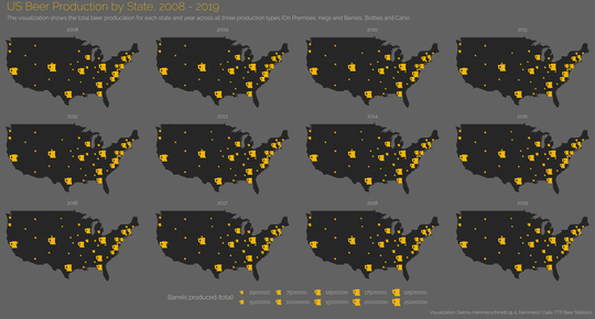
US Beer Production
Microbreweries are on the rise. I use data from the TTP Beer Statistics to show which US states brew the most beer and how the production changed over time.
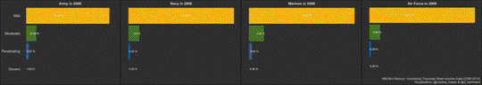
Traumatic Brain Injuries
Together with Cosima Meyer, we develop an animated graph to show the distribution of Traumatic Brain Injuries in the US military over time.
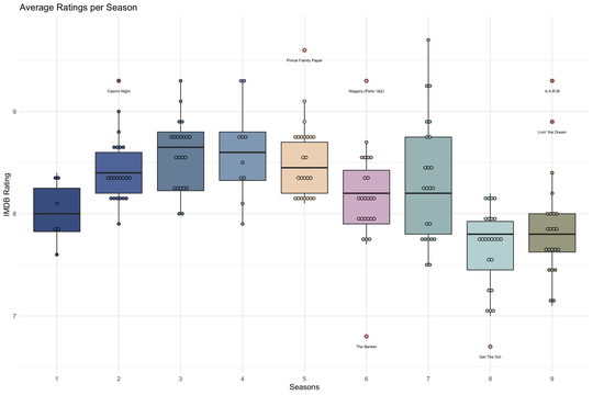
The Office Ratings
The Office is one of the greatest shows ever! How did the ratings develop over time and what happened to the ratings in the last two seasons when Michael Scott left the show? Let’s find out! I use IMDB rating data and the full scripts of each episode in the schrute package to anaylze via XGBoost Trees whether more lines on an episode – and especially those of Michael Scott – have an impact on the ratings of the show.
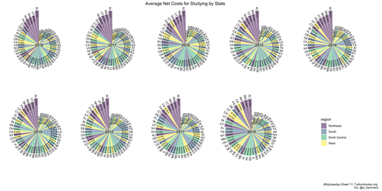
My first tidytuesday!
I use data on US college tuition to see whether some regions are more expensive to study than others.